DESIGN DECODED
Motion for Design Decoded↗, a career-focused design event hosted by one of my clubs Innovative Design at UCLA↗.
The wonderful brand design team had put together a beautiful logo and style guide, and just needed someone to animate and bring certain social media posts to life, which is where I came in.
ROLE
Animator
CATEGORY
Work / Community / Personal
TOOLS
After Effects
TEAM
Event Director Daniel Ogura
Marketing VP Iris Lim
Brand Designers Maya Yoder, Jessica Zhuang, Sophia Ko

1️⃣ TEASER VIDEO
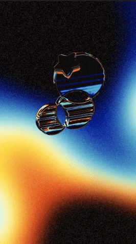
My first project in this series was a teaser video— no event details, no text— just a theme change from InnoD's usual Instagram feed to the grainy, prismatic colours of Design Decoded's branding. The brand design team had provided me the beautiful logo + style guide they created along with a selection of texture and photos assets and asked me to come up with something minimalistic.

the brand design team's style guide
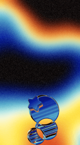
I decided to have a moving gradient that imitated one of the photos the team provided, and the metallic InnoD logo floating up through it as if it were in space. To create the gradient, I followed a tutorial manipulating a fractal noise layer in After Effects.
Instead of using the 3-tone CC Toner effect that the tutorial suggested for a non black-and-white gradient, I ended up experimenting with Colorama, which allowed me to add all 6 colors I needed for the light prism effect.
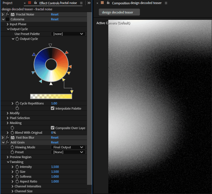

adding colorama
Then it was time to add the metal InnoD logo. Originally, I had hoped to work with a 3D model so I could move the logo around freely in the scene. I asked the logo designers on the brand team for a 3D file, but they didn't create the metal effect with any 3D software. This meant I had to work with the 2D image.
I converted the 2D image to a 3D layer to test if my original idea would still work. While I could still rotate the logo on the XYZ axis and make it look like it was tilted, I couldn't rotate past certain points, or it would become apparent that the logo was flat— like a Paper Mario effect.

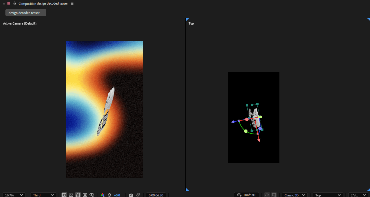
logo facing forward vs. rotated to the side
With this limitation, I had to keep the logo animation subtle, without any dramatic rotations or flips. I keyframed the positions from bottom to top of the screen with minor rotations throughout, making sure that the logo paused for a couple seconds once it hit the center of the screen for emphasis.
Finally, I added the same Colorama effect onto the logo so it would take on color and look like it was part of the environment around it.
However, the Colorama wasn't enough by itself; I wanted to replicate the refraction of light through glass found in real life.
After experimenting with different effects, I found that tweaking the "Glow Threshold" parameter in the Glow effect nicely changed the levels of the Colorama.
I keyframed this parameter to match the background movements; when the background was darker I'd turn the Glow Threshold down, and vice versa for when it was brighter, making the logo much more dynamic and visually interesting.


logo without glow effect


logo with keyframed glow effect
final video
2️⃣ THEME REVEAL
Following the teaser video, our marketing team created a general announcement post outlining event details and how to RSVP. My second project after this was an Instagram reel to reveal Design Decoded's theme.


instagram announcement post created by our marketing team
I decided to switch up the gradient background so it wouldn't look too similar to the teaser video. I color picked the more greenish palette from the Instagram announcement carousel into the Colorama effect, and played with the fractal noise settings until I got this square pattern. After that I added 2 adjustment layers on top, one with a Fast Box Blur and one with Grain.
Then I placed the Design Decoded logo in the center and keyframed the 2 adjustment layers to make a camera focus effect— since the theme is, spoiler, "Future in Focus".

The last step was to make a transition from the intro to the "Future in Focus" text. I've used a lot of crossfades before, but I thought it would suit the branding to have a parallax effect and make the text feel like it's moving through space. I keyframed the positions of the background, the intro text, and "Future in Focus" to achieve this, the background moving slightly slower than the text to make it feel further away.
To top it all off, I added layered camera and keyboard sound effects for the intro, a moving blur across the "Future in Focus" text, and it spin out in a match-cut to the InnoD logo.