PARK INVESTING
Park Investment is a startup and mobile app that aims to simplify investing and finances. As the first designer on the project, I developed the visual brand of Park through a style guide and logo. I also designed the first pass of the app's user interface for its beta launch.
ROLE
UI Designer
Graphic Designer
CATEGORY
Work / Community / Personal
TOOLS
TEAM
Founders Brian Ton, Zinnia Kwan
iOS Engineers Andrea Wu, David Su
Backend Engineer Andre Saldanha
Growth Yajing Feng
Designer Ella Chen
🎨 BRANDING AND STYLE GUIDE
The name "Park" comes from the founders, Brian and Zinnia, who got the idea for the app after brainstorming sessions in their local park. The concept of creating a space that’s both natural and accessible resonated with me when designing the visual brand.
For the color palette, I drew inspiration from public parks like Central Park in New York—places that are full of nature but still buzzing with modern city life. The greens aren’t the deep, isolated tones of a forest, but instead the bright, welcoming colors of flowers and people in an urban environment.
The main selling point of Park is simplification of niche investment ideas, so I opted for sans-serif over a traditional serif for an approachable energy.

design system
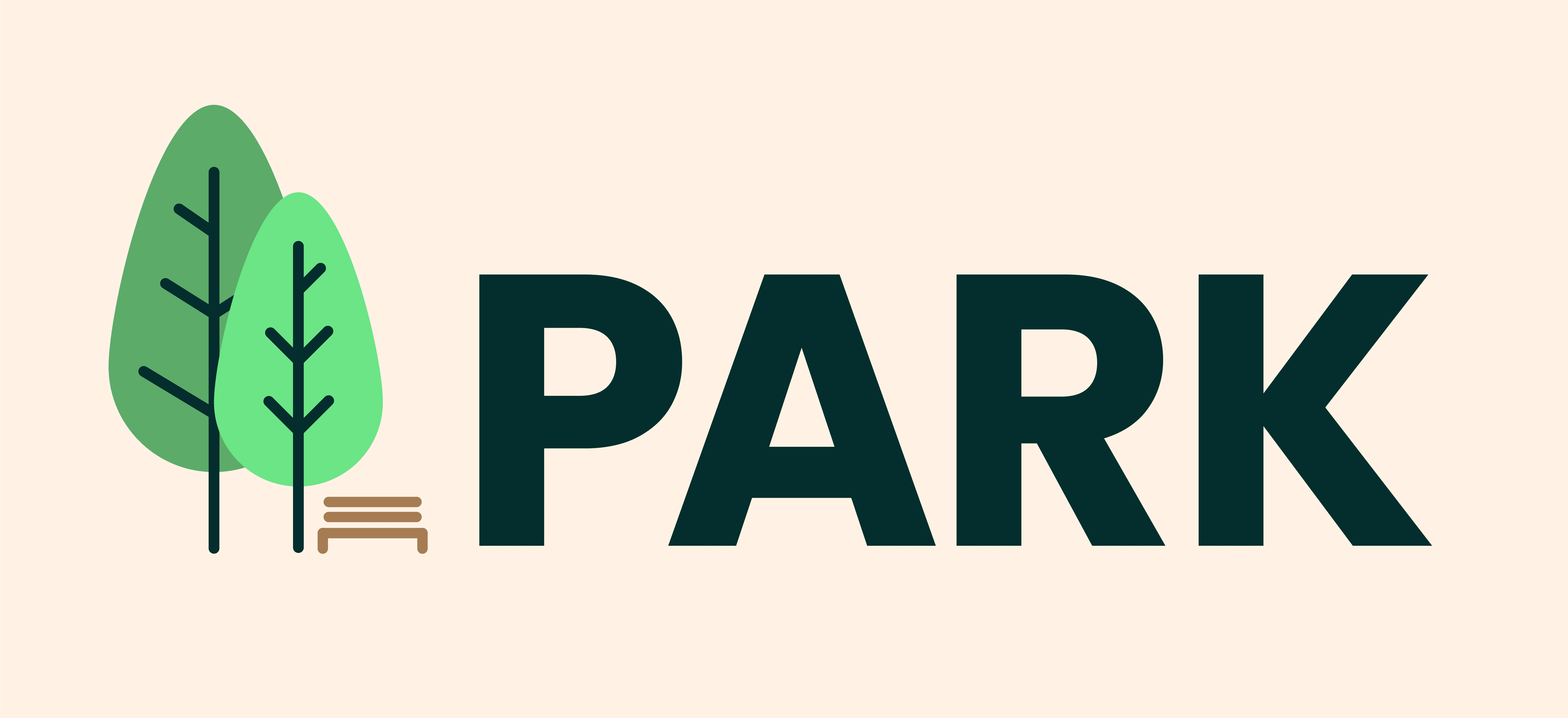
📌THE LOGO
I started off drafting logos with vectors in Illustrator, using a minimal approach to match what the team pictured for Park's mobile interface. The Park team liked the two non-abstract trees most, and suggested adding a bench to make it more recognizable as a park.

lofis

final app icon
final horizontal lockup
🖽 WIREFRAMING
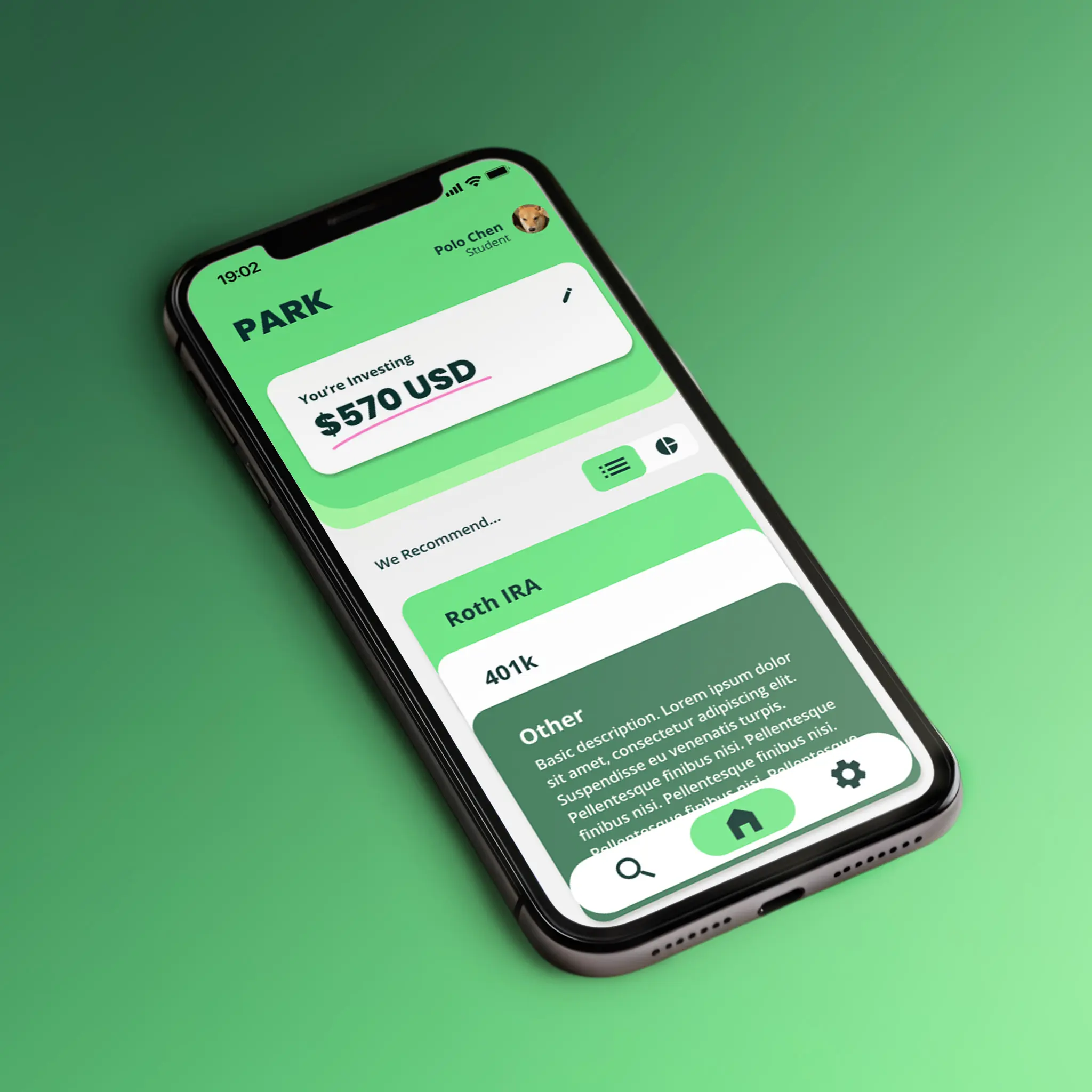
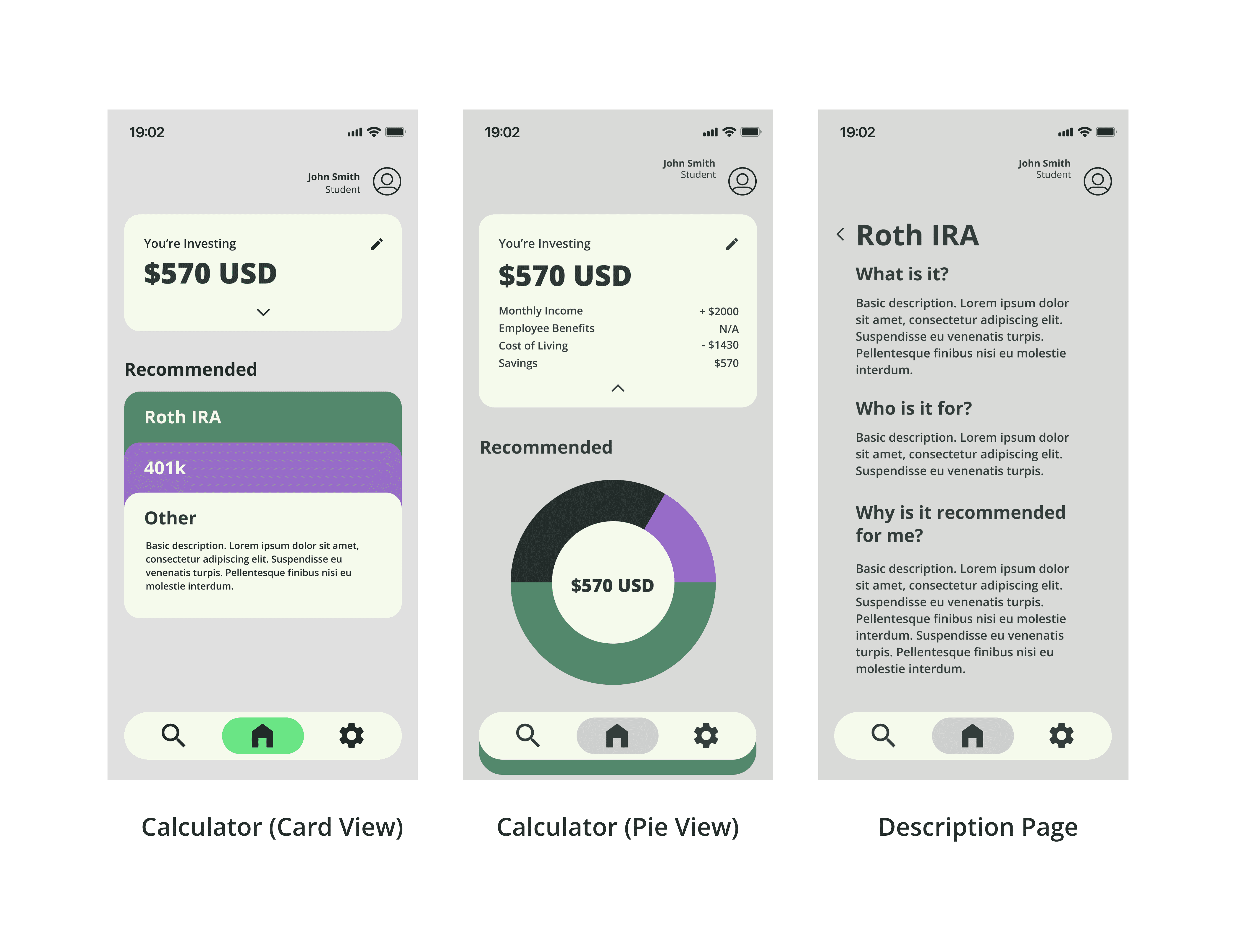
The main feature of the Park app revolves around the home page—the calculator. Users input details like monthly income and cost of living to view a graphic that breaks down how to allocate their money.
As I began designing the page, I considered different approaches, like whether a card view or pie chart would be more effective, how investment descriptions could pop up, and how users would input values. After discussing with the team and reflecting on the flow, I identified a few questions:
The calculator input method, if kept on a dropdown in a card, was too small and hard to read. How could we make inputting numbers into fields more accessible?
Are the cards and pie charts interchangeable? Which one should we use and why?
MID-FI WIREFRAMES
In the second iteration of the app, I focused on refining the calculator view and its input fields. Since the developers were prioritizing this feature, I shifted my attention here before working on the investment description pages, which contained content still in the process of being finalized.
My first step was to enlarge the text and apply colors from the design system to improve visual appeal and make the content easier to scan. I also decided to move the input fields off the home page—clicking the edit button would now lead users to a new page with clearly separated and easy-to-select fields.
Additionally, I introduced a toggle switch between card and pie chart views. Both views served different purposes: the pie chart provided a quick summary, but the card view was more fitting as the default, since Park's ultimate goal was to present longer text-form content.

MOCKUP
To help the developers better visualize the calculator input's user flow, I created a prototype animation in Figma demonstrating how users would interact with the input fields.
🤔 WHAT I LEARNED
The mockup was my last contribution to Park before the project went on hiatus for recruiting season, and I stepped down as designer to focus on other active projects.
I'm really appreciative of the opportunity; as the sole designer, I learned how to be decisive in my design choices. Without a creative team to bounce ideas off of, it was sometimes challenging to determine the best approach, but it pushed me to trust my instincts confidently.
Looking back on the project, I think there are many areas of improvement. The style guide had potential to be more extensive and become a full design system with UI/UX components and layout guidelines, and the logo is difficult to process at small sizes with its muted colors and poorly separated shapeforms. While I won't be working on Park again in the future, I'll definitely take the lessons I've learned into my future projects!