🎯 OVERVIEW
The Napa Valley Transit Association (NVTA)↗ was looking to promote their rewards program, VCommute, which gives participants points for choosing environmentally friendly transit options over driving.
drafts
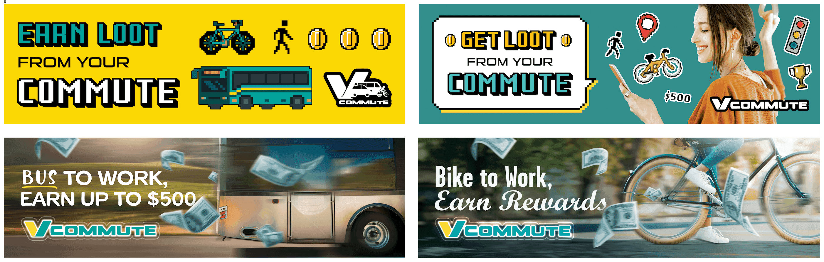
🔄 FIRST DRAFT
In our initial brainstorm, the idea of a game-inspired concept came up, so I explored 8-bit graphics and "loot"-style rewards. I also developed a more flexible direction with a swappable copyline where "Bus" or "Bike" could also be "Walk", "Carpool", etc. should the client want to expand the campaign.
After presenting my drafts to the team, the feedback was clear: the typography needed to be bolder, and while the game concept was fun, the photo-based design felt stronger and more aligned with the client’s goals. I moved forward with refining the “___ to work” concept for client presentation.

updated designs
💬 FEEDBACK
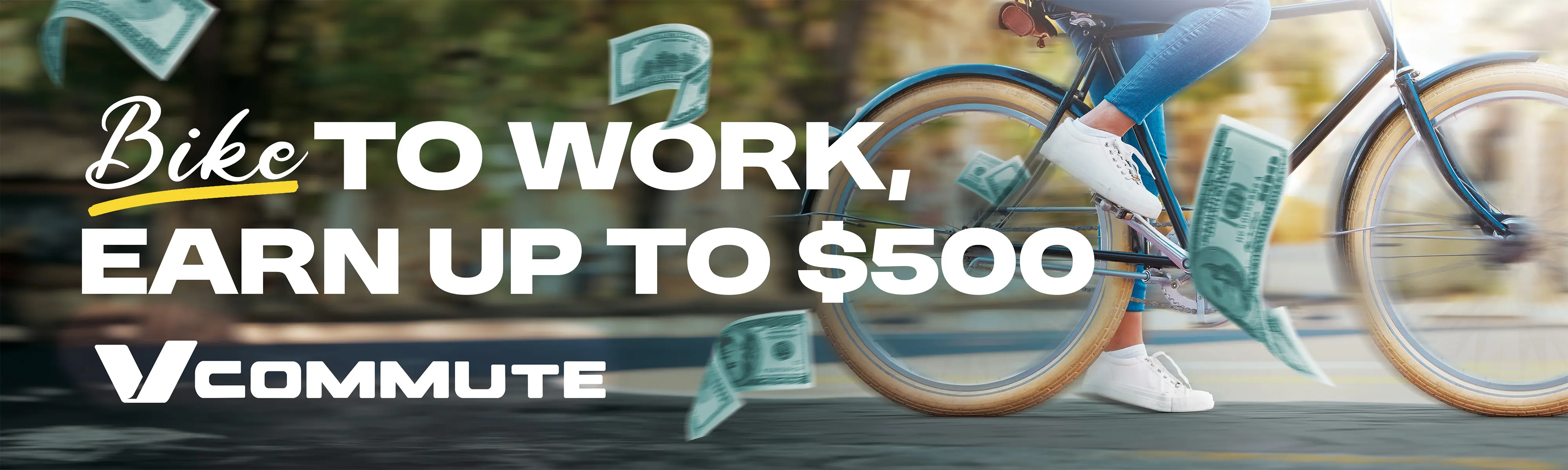
The clients liked the copyline and concept overall, but felt the color palette was too muted. Daniel (the Senior Art Director) and I explained that the all-white text was chosen for legibility from a distance—crucial for billboard readability.
Despite our rationale, the client still requested that the white text and logo be replaced with their brand colour gradient and the bus be replaced with photos of their actual bus.
I made the requested changes while communicating that the colored text might create a busier visual. Ultimately, the client finalized these edits.


client's final requested design
🤔 WHAT I LEARNED
This project taught me a key lesson in client relations: sometimes, the job isn’t just about design—it’s about collaboration and compromise. Not every suggestion will be embraced, and that’s okay. Learning how to navigate those moments professionally is just as important as creating strong visuals.